Using alcohol markers on toned paper starts with a choice: keep the paper tone as your light, adjust a color, test a separate white medium, or return to white paper. Decide from dry swatches on the exact sheet you plan to use. A familiar pale blue may serve a different role there, and an untouched highlight will retain the paper's color.
Named creators already demonstrate these changes, including a white-versus-dark-gray floral comparison by Therese at Altenew. Their examples guide the checks below. They don't establish a result for your markers and paper, and Finecolour has not run a physical toned-paper trial.
Key takeaways
- Choose the lightest value the image needs before filling the sheet.
- Judge dry hue and light-dark separation as separate observations.
- Compare exact stocks, then test added white separately if needed.
Start With the Lightest Value You Need
Look at an untouched part of your sheet. That tan, gray, or other color is the starting surface for the drawing. Leaving an area uncolored preserves it, so decide whether it can represent the light you want.
Value means how light or dark something appears. Hue describes its color, such as blue or pink. A swatch can look blue enough for your subject yet sit too close to the surrounding paper in value. Another may stand out clearly but miss the color you intended.
Leave the paper tone as the light
A subdued drawing can use the sheet itself for its light areas. In Therese's Altenew tutorial, published 2023-01-05, she colors a floral image on familiar white cardstock and then dark gray cardstock. She keeps the gray version within her marker palette and accepts its quieter appearance.
Preserve a small untouched area as you try the colors. Compare it with the intended light area of your subject. If the base suits that job, you can keep it visible rather than covering the entire drawing.
Taria's toned-paper guide emphasizes leaving parts of the paper untouched. It includes several media, so its ink and watercolor examples should stay separate from alcohol-marker results. Use the visible-paper idea as a compositional choice, then check your own marker marks.
Plan for a brighter accent
If the intended accent needs to look lighter than the base, evaluate a separate white medium or white paper. Marcel Saleta's tan-paper demonstration leaves paper visible during marker work and later adds white pencil. The pencil supplies an added light that the untouched tan can't provide.
Mead McLean's gray-paper demonstration uses Copic W2, W5, and W8 with Prismacolor white pencil and a white Uni-ball Signo gel pen. His W2 sits close to his paper tone. That illustrates a value choice on his gray sheet, not a prediction for colored inks or tan paper.
Those are separate white tools in separate setups. They establish neither a universal winner nor compatibility with your materials. Before committing, test a named white highlight medium on your exact sheet and dry marker area.
Read the Named Color-Shift Examples
Therese's example already makes the paired-paper comparison useful. In the companion video, her first blue looks too gray for the petals on dark gray cardstock. She changes to the middle blues, then uses the pale blue for a gray-looking leaf. The practical lesson is to reassess a color's role after swatching, rather than assume its white-paper role will carry over.
Windy Iris reports different dry colors with Copic markers on Strathmore Toned Tan. She makes a chart on that sheet and notes particularly different blues. Her observation after about five minutes belongs to that session. It isn't a drying interval for another marker or stock.
For alcohol markers on kraft paper, Lindsay Adreon's 2016-06-17 tutorial uses Dick Blick Studio Brush Markers. She swatches on the same kraft cardstock and checks the groups after drying. In her companion video, a light blue initially appears brownish on that sheet.
A 2019-06-30 Altenew colored-cardstock tutorial, narrated by Norine, uses the same blue group on teal and gray stocks and describes different appearances. It adds white embossing after coloring. The finished cards include more than marker color and paper tone.
Copic's paper FAQ, checked 2026-10-13, explains that its dye-ink colors can appear more vivid or dull depending on paper. That maker explanation concerns Copic's ink. These observations support testing the chosen sheet, without supplying a color-conversion formula or replacement code.
Compare White and the Exact Toned Sheet
Use a familiar white sheet beside the exact toned stock intended for the drawing. Identify both, including any printed stock name and known paper weight. Tan drawing paper, gray cardstock, and kraft describe different options, not one interchangeable surface.
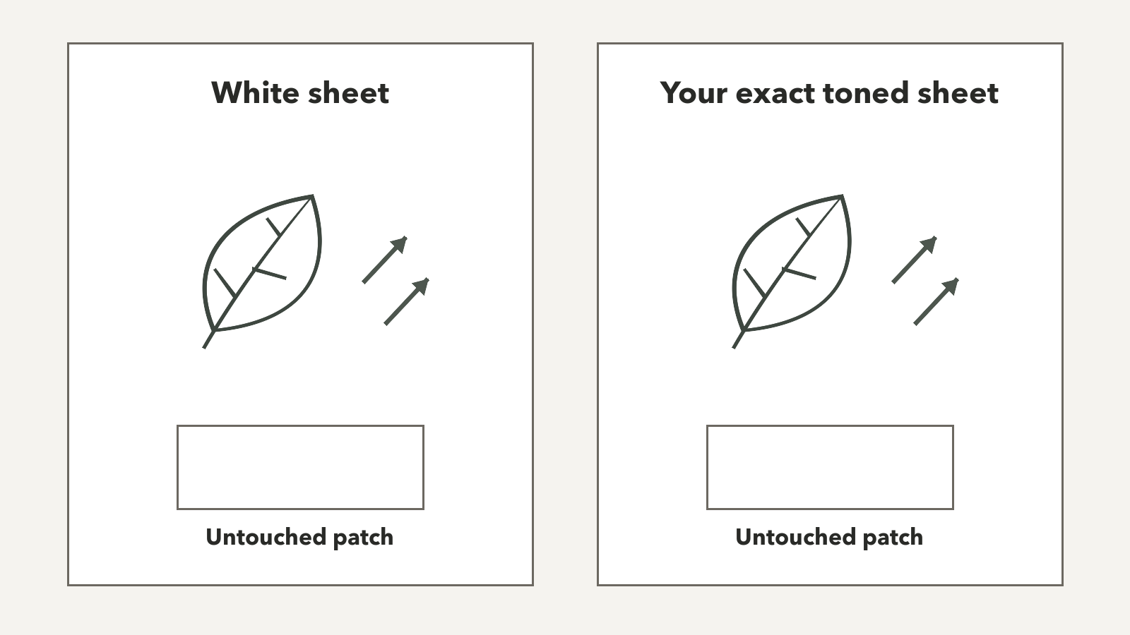
Draw the same small subject outline on each. Choose a part that uses the colors and light-dark steps you need, such as one petal or leaf. Leave an untouched patch beside each outline so you can compare the dry marks with the starting surface.
Keep the marker, nib face, shape size, stroke direction, number of passes, backing, dry checkpoint, and viewing light the same. Label the marker codes beside the panels. For a broader surface choice, use general paper selection alongside this appearance check.
Record dry hue and value separation
Wait until the colors appear dry before making the comparison. Record the checkpoint you used, then look at both panels in the same light. Don't substitute a creator's wait time for your own observation.
Describe dry hue first, then check whether the intended lighter and darker areas remain visibly distinct. Inspect the edges and reverse separately. You can check bleed-through separately without treating a pleasing toned appearance as evidence of protection for the next sheet.
| Observation | White sheet: your entry | Toned sheet: your entry | Comparison limit |
|---|---|---|---|
| Exact stock and known weight | — | — | Record unknown stock details as unknown. |
| Dry hue | — | — | Appearance belongs to these markers and sheets. |
| Lightest visible value | — | — | Distinguish untouched paper from added white. |
| Separation of intended values | — | — | Judge the steps needed for this subject. |
| Visible handling | — | — | Note edges, reverse, and ink reaching the backing separately. |
| Final substrate choice | — | — | Choose for this image and tested setup. |
Note the limits of the two sheets
This comparison can tell you which setup serves the drawing. It can't isolate paper color when the sheets differ in other ways. Weight, sizing, texture, and absorbency may all change between stocks. Sizing is a paper treatment that affects how the sheet takes liquid.
Even matching application leaves those stock differences in place. If one panel handles differently, record the visible behavior without assigning it solely to tan or gray pigment. A different toned stock needs its own check, including another shade from the same pad.
Choose the Next Step From Your Dry Record
Choose the route that fits the intended image. The familiar white result is a reference for your expectations. The toned result may support a different appearance you prefer.
- Keep the tone when the untouched sheet provides a suitable light and the dry colors separate clearly enough for the subject.
- Revise one palette role when a color misses its intended job. Try a new swatch before replacing it across the drawing.
- Test separate white when the colors work but the required accent needs to rise above the paper tone.
- Return to white paper when the toned setup doesn't provide the appearance you need, or you prefer to work without added white.
For a palette revision, change one candidate at a time and keep the original dry panel beside it. Therese's pale blue moved from a flower-color role to a gray leaf role. Your choice may be to replace the color, give it another role, or accept the changed appearance.
Keep the first comparison marker-only so added pencil or gel doesn't obscure the paper decision. Vili's 2015-03-01 Copic-on-kraft tutorial uses white pencil and gel accents, but its order remains a historical example. Before combining media, check marker and colored-pencil order. Neither that tutorial nor a white tool's name proves a result on your sheet.
Check Screen References Against the Sheet
A screen preview can help organize a palette, but it can't tell you how a marker will dry on toned paper. Finecolour's stored HEX references describe screen colors, not measurements of ink on your chosen stock. A familiar-looking preview doesn't resolve either dry hue or value separation.
Read the Colour Data Method for the distinction between recorded values, calculations, and physical swatches. Use your dry sheet comparison to decide what belongs in the drawing. It supplies the paper-specific evidence that a digital reference can't.
Closing: Make the Paper Choice Before the Drawing
Choose alcohol markers on toned paper for the appearance the tested sheet can give your image. Keep the untouched tone if it works as the light. If a dry color misses its role, revise that choice on a fresh swatch. If the image needs a brighter accent, test separate white or use white paper.
Retain the small comparison with its stock names, marker codes, and dry checkpoint. It records the setup behind your decision. A new paper shade or different stock opens that check again, even when the marker codes stay the same.
Sources
- Copic paper FAQ. Undated maker explanation, checked 2026-10-13.
- Take 2 with Therese: Artist Markers on colored cardstock. Published 2023-01-05, checked 2026-10-13.
- Vili: Colouring with Copic markers on Kraft Paper. Published 2015-03-01, checked 2026-10-13.
- Lindsay Adreon: Coloring on Kraft with Alcohol Markers. Published 2016-06-17, checked 2026-10-13.
- Taria: Urban Sketching on Toned Paper. Publication date unavailable, checked 2026-10-13.
- Altenew: Artist Markers on Colored Cardstock. Published 2019-06-30, checked 2026-10-13.
- Marcel Saleta: Alcohol Markers on TONED PAPER. Original creator transcript, checked 2026-10-13.
- Windy Iris: Tips for Coloring with Copic Markers on Strathmore Toned Tan Paper. Original creator transcript, checked 2026-10-13.
- Mead McLean: Gray Paper, Markers, and Prismacolor Pencils. Original creator transcript, checked 2026-10-13.
- Lindsay Adreon: Kraft video. Original creator transcript, checked 2026-10-13.