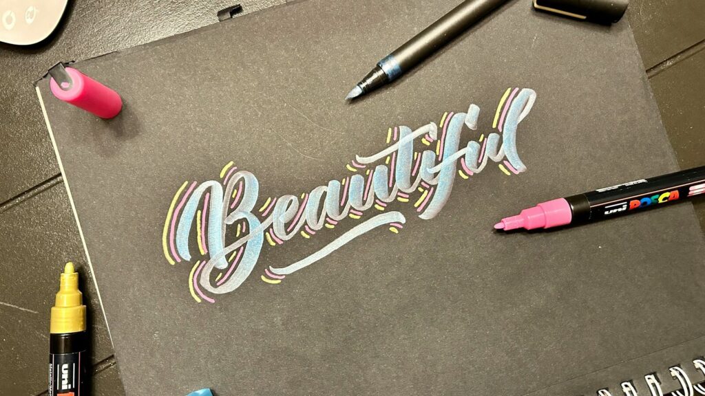
Markers for hand lettering should earn their role on the exact paper you plan to use. An alcohol-marker nib might repeat a thin upstroke and thick downstroke, or it might lose shape before the first word is done. A small same-paper test tells you which lettering path fits the tool in your hand.
This guide starts with that gate. A passing nib can move into pressure lettering, and a failing nib can still produce monoline faux calligraphy with drawn downstrokes. You will then dry-swatch neighboring colors, place a backing sheet below the final paper, try one bounded ombre, and log five separate signals. Finecolour Brush is one candidate for this test, not a proven lettering winner.
The test does not ask you to crown a brand. It asks you to match one tool, one sheet, and one lettering job.
Key Takeaways
- Test the actual nib on the final paper before choosing pressure lettering. Proceed only if it makes repeatable thin upstrokes and thick downstrokes without losing its shape.
- If the nib fails that gate, use monoline letters and manually thicken the downstrokes. Faux calligraphy keeps the style available without pretending the marker is flexible.
- Swatch neighboring colors on the final paper over a backing sheet, then build one short light-to-dark ombre when the tested area stays workable.
- Record bleed-through, edge spread, streaking, muddy joins, and nib recovery. Treat Finecolour Brush as one candidate to test, not a proven winner.
Markers for Hand Lettering: Choose Pressure Strokes or Faux Calligraphy
The product label does not choose your lettering path. Start with the actual nib and the final paper, since both affect the marks you can repeat. A brush name can describe a product range without proving flexible response, clean edges, or quick nib recovery.
Use an offcut from the final sheet or a hidden margin. Label the marker, color, nib end, and paper before adding ink. Draw five light upstrokes, five heavier downstrokes, and one short practice word, then let the strip rest long enough for a dry edge check.
Use the same grip for the whole set, but do not chase a universal angle. A repeatable hold matters more than copying someone else's 45-degree note, since barrel shape, hand position, and the tested tip change the feel. Keep force modest at first, then increase only enough to reveal contrast on the strip. The aim is controlled difference, not the deepest possible mark.
Run the actual-nib thin/upstroke versus thick/downstroke gate
A pass means more than one pretty stroke. The thin lines need a repeatable width, the thick lines need controlled edges, and the nib needs to return to its starting shape between marks. Compare the fifth stroke with the first instead of judging each mark alone.
Look at the nib and the paper. If it stays compressed, splays, frays, drags, or produces widening upstrokes, stop the pressure route. The dual-tip versus brush-nib markers guide can help you name each tip's broad role, but your own strip decides what this nib can do here.
| Test | Pass signal | Fallback signal | Record |
|---|---|---|---|
| Five light upstrokes | Similar thin widths | Lines widen or catch | First and fifth widths |
| Five heavier downstrokes | Clear, controlled contrast | Edge spreads or nib flattens | Edge and nib shape |
| Short practice word | Contrast repeats in curves | Control changes by letter | Letters where it shifts |
| Nib release | Tip returns after each mark | Tip stays bent or slow | First versus last response |
If every row passes, try pressure lettering on one more practice word. Use the angle and force that your strip supported, not a prescribed number. Stop again if later strokes lose contrast or edge control.
If any row fails, switch paths at once. Write a monoline word with one stable line width, mark the downstroke sides, close those added shapes, and fill them. This route creates calligraphy-style contrast by drawing it, so there is no need to press harder on a nib that did not cooperate.
Set Up the Final-Paper Nib, Color, and Bleed Test
Build the test around the finished piece, not a random practice pad. Paper coatings, fibers, and absorbency can change edge spread, streaking, and reverse-side bleed. Use the exact final paper when you can, or cut a strip from the same stock.
Use the final paper and protect the sheet below
Place a clean sacrificial sheet beneath the test. That backing sheet catches ink that travels through, protecting the desk or next page. It does not stop the active sheet from bleeding, feathering, or forming a soft edge.
Keep the test strip roomy. Leave dry paper between the light strokes, heavy strokes, practice word, and color swatches so one wet area does not feed another. Label the paper, marker code, nib end, and pass count next to each sample.
Inspect the front only after the ink has settled, then turn the paper over. The best paper for alcohol markers guide covers broader paper choices, but this strip answers the narrower lettering question. Record what happened on this paper without naming it a universal winner or failure.
Dry-swatch neighboring colors before they touch a word
Choose a light base and one darker neighboring color from your own swatches. Put each color down alone, label it, and wait for the dried appearance before pairing them. A close color relationship is a useful starting control, not proof of a clean blend.
Record the same facts for each swatch. Note the marker label, nib end, pass count, dry color, edge shape, and reverse-side mark. Do not let a wet, attractive join hide a spreading edge or a saturated back.
| Control | Lock before lettering | Observe after drying | Why it matters |
|---|---|---|---|
| Final paper | Exact sheet or same-stock offcut | Edge and surface change | Matches the planned piece |
| Backing sheet | Clean sacrificial paper | Ink transferred below | Protects the next surface |
| Marker and nib | Label code and tip end | Stroke control | Makes the test repeatable |
| Stroke count | Five light and five heavy | Width and saturation | Separates pressure from buildup |
| Practice word | One short word | Curves, joins, streaks | Tests connected marks |
| Neighboring pair | Light base and dark accent | Dry color and join | Screens the ombre pair |
| Reverse side | Inspect after full dry | Bleed-through | Shows active-sheet travel |
Build Letterforms with the Path Your Actual Nib Passed
Sketch one short word lightly before adding the marker. Give each letter enough space for the chosen route, and keep the first run on the test area. The passed path tells you how to create contrast, but it does not promise the same response on a longer word or a wetter section.
Use pressure lettering only after the nib passes
Set the marker at the comfortable angle that produced repeatable marks in your own strip. Draw light upstrokes and heavier downstrokes, lifting or easing off between parts of a letter when control starts to change. Keep your wrist position steady enough to compare one stroke with the next.
Work letter by letter rather than rushing across the word. Pause after a curve or join and compare it with the first test marks. If the thin line widens, the edge starts moving, or the nib stays compressed, stop pressure lettering before more force turns a small warning into a damaged tip or soaked word.
Water-based brush pens remain a sound separate option for pressure-based brush lettering. Loveleigh Loops' brush-pen lettering guide uses water- or pigment-based tools for its stroke teaching. That vocabulary can help you identify upstrokes and downstrokes, but its ink and blend behavior does not prove what an alcohol marker will do.
Switch to monoline faux calligraphy when the nib fails
Write the whole word with one controlled line weight. Next, identify every downstroke, draw a parallel line beside it, close the top and bottom of that new shape, and fill the enclosed area after the first line feels stable. Keep the added width on a consistent side. Change sides only when the letter shape calls for it.
This method follows the general manually thickened downstroke route taught by Hand Lettered Design and By Heidi Grace. It does not depend on nib flex. It is the safer path when a bullet, chisel, firm brush, or tired tip fails to repeat pressure contrast.
| Stage | Pressure-lettering path | Faux-calligraphy fallback | Stop/check |
|---|---|---|---|
| Layout | Plan thick and thin movement | Plan room for added width | Word fits the test strip |
| Upstroke | Use tested light force | Keep one line weight | Line stays controlled |
| Downstroke | Use tested heavier force | Mark the side to widen | Nib keeps its shape |
| Curve | Ease force through the turn | Draw a clean monoline curve | Edge stays inside layout |
| Join | Connect with passed contrast | Join first, widen second | No dark pool at the join |
| Fill | Not needed for contrast | Fill closed downstroke shape | First line remains readable |
| End of word | Compare first and last strokes | Check filled shapes and edges | Stop on lost control |
Blend a Bounded Ombre with Neighboring Swatched Colors
Run the ombre only after both colors have passed the separate dry-swatch check. Use a short practice word or test strip, not the finished piece. The goal is to learn how this pair, paper, ink load, and nib respond within one small area.
Map the light base and dark accent before ink
Mark a light-base zone and a smaller dark-accent zone in pencil or on a separate layout. Keep the dark area limited to one end of the word, one row of letters, or a short set of strokes. A clear boundary makes it easier to see how far the accent moves during the blend-back pass.
Choose the pair from dried neighboring swatches, then check the alcohol marker color theory guide for broader color relationships. That link supplies planning language, not a result for your pair. Your same-paper strip remains the proof for this exercise.
Add the darker color, then blend back only in a workable test area
Lay the light base across the planned test word. Add the dark accent only inside its marked zone, then make one restrained blend-back pass with the light marker through the join. Stop and inspect before deciding on any correction.
The local area remains workable only as an observation from your test. There is no fixed time window, force, or pass count for every paper and marker. A glossy wet look, widening edge, roughened paper surface, or changing nib response is a reason to stop, not a cue to add more ink.
Doodlecraft's affiliate-linked ombre example shows a light base, dark accent, and blend-back sequence. The accessible post does not identify the paper or marker brand, so it offers an example rather than a universal recipe. Lettering by Karen's creator demonstration favors neighboring colors, uses a protective sheet, and treats local blending as time-sensitive, again as one artist's observation.
| Pass | Job | Observe | Stop/check |
|---|---|---|---|
| Dry swatch | Screen the neighboring pair | Dried color and clean edge | Reject an unclear pair |
| Light base | Cover the planned test zone | Streaking and saturation | Stop on spreading edges |
| Dark accent | Add color only in the map | Accent travel and join | Keep it inside the limit |
| First blend-back | Cross the join once | Color distinction and bands | Stop on mud or rough paper |
| Optional correction | Make one small fresh-strip test | Better or worse control | Do not flood the word |
| Full dry | Inspect front and reverse | Final edge, join, and bleed | Record before another try |
The optional correction belongs on a fresh strip when possible. Reduce its size, hold the marker and paper labels constant, and change one factor, such as overlap length. If the join turns muddy, streaking grows, the paper looks saturated, or the nib recovers slowly, end that run.
The how to blend alcohol markers guide owns the broader blend mechanics. Here, keep the task narrow. One neighboring pair, one small word, one planned accent, one blend-back pass, and at most one bounded correction give you a readable record without claiming a guaranteed fix.
Record Bleed, Edge Spread, Streaking, Muddy Joins, and Nib Recovery
Wait for the practice word to dry, then score observations instead of the product. Check the front, reverse, edges, joins, stroke bands, and nib shape. A pass in one row does not erase a problem in another, so keep the five signals separate.
Record five signals separately
Bleed-through is ink visible on the reverse of the active sheet. Edge spread or feathering is ink moving past the line you meant to draw. Streaking is the directional banding left across a filled stroke or letter.
A muddy join loses useful light-dark distinction in an overworked patch. Nib recovery compares the shape and control of the first strokes with the last ones. Record what you see without turning one strip into a claim about every sheet or marker.
Make one bounded next test, then stop
Change one factor on a fresh same-paper strip. For edge spread, shrink the inked area or lower the pass count. For streaking, compare one controlled overlap with the first sample instead of flooding the word.
For a muddy join, return to the separate dry swatches and test a shorter overlap. For slow nib recovery, end pressure lettering and use monoline faux calligraphy or another tested tool. A second small test can reveal a direction, but it does not promise repair.
| Signal | What to record | Bounded next test | Stop rule |
|---|---|---|---|
| Bleed-through | Reverse-side ink area | Smaller fresh-paper sample | Ink reaches the backing sheet |
| Edge spread | Distance past the intended line | Lower pass count | Edge keeps moving |
| Streaking | Direction and width of bands | One controlled overlap | Bands grow darker |
| Muddy join | Lost light-dark distinction | Shorter overlap from dry swatches | Colors lose separation |
| Nib recovery | First versus last shape and control | One unloaded stroke set | Tip stays bent or drags |
Keep Finecolour Brush conditional and sponsorship visible
The Finecolour Brush range page confirms a Brush-named range and its listed inventory. It does not prove nib flex, crisp edges, clean blends, or recovery. Finecolour is one candidate in the same physical test used for any marker, and this site is an independent resource rather than the brand's official dealer.
Keep creator examples tied to the tool and paper they show. One disclosed Arrtx test reports different streaking on HP Premium 32 and Archer & Olive, with the creator unsure why. S1VE's sponsored Ohuhu demonstration shows lettering construction and brush-tip cleanup, but it is sponsored brand material. Doodlecraft's example carries affiliate or sponsored ties, and none of these examples supplies a Finecolour result.
The record should show a tested nib, a conditional pressure route, and an available faux-calligraphy fallback. It should name the final paper and backing sheet, show neighboring dry swatches, bound the ombre, and log all five signals. It should distinguish water-based brush pens, disclose sponsored material, keep Finecolour candidate-only, and avoid a universal verdict on the product, nib, paper, blend, bleed, edge, or recovery.
FAQ
Can you use alcohol markers for hand lettering?
Yes, but test the actual nib on the final paper first. Use pressure lettering only when it repeats thin upstrokes and thick downstrokes without losing control or shape. If it fails, write monoline letters and manually thicken the downstrokes. That fallback does not require a flexible brush nib.
Can you use alcohol markers for calligraphy?
They can make calligraphy-style lettering through two different paths. A nib that passes the stroke-contrast gate can support pressure lettering. A nib that does not pass can still make monoline faux calligraphy with drawn and filled downstrokes. Neither route makes every alcohol marker a universal calligraphy tool.
How do you blend alcohol markers for lettering?
Dry-swatch neighboring colors on the final paper first. On a short practice word, lay a light base, add a limited dark accent, then make one blend-back pass as long as the local area remains workable. Stop if the join muddies, edges spread, streaking worsens, or the paper looks overworked.
What paper should you use for alcohol marker lettering?
Use the paper planned for the finished piece, then test it rather than trusting a universal label. Put a backing sheet underneath, inspect the dry front and reverse, and record bleed-through, feathering, streaking, and edge control. The backing sheet protects the next surface but does not prevent bleeding on the active sheet.
Are Finecolour Brush markers a good hand-lettering choice?
The current range page confirms that Finecolour has a Brush-named range, not that its nibs win lettering tests. Treat it as one candidate. Run the same thin-upstroke, thick-downstroke, final-paper, and recovery checks used for any marker. Water-based brush pens remain a distinct alternative when pressure lettering is the priority.
Conclusion: Let the Test Choose the Lettering Path
Your best markers for hand lettering are the ones that pass your labeled same-paper check. Test the actual nib, choose pressure lettering only after repeatable thin and thick strokes, and switch to monoline faux calligraphy if control fails. Dry-swatch neighboring colors on the final paper, protect the next surface with a backing sheet, and keep the ombre short.
Then record bleed-through, edge spread, streaking, muddy joins, and nib recovery. Finecolour Brush remains one candidate, not a proven winner. Run one practice word first and keep its record beside the finished piece.
Sources
- Loveleigh Loops: Brush Pen Lettering for Beginners
- Hand Lettered Design: Using Markers for Faux Calligraphy
- Doodlecraft: Ombre Brush Calligraphy Lettering Tutorial
- Ensign Insights: Can You Hand Letter with Arrtx Alcohol Markers?
- Lettering by Karen: How To Blend Alcohol Markers
- S1VE: How To Draw 3D Graffiti Letters