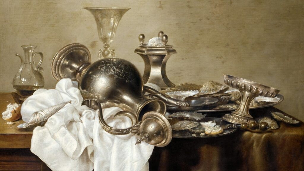
How to color metal with markers starts with naming the material cue in your reference, not copying a marker recipe. Polished metal may show close light and dark shapes. Brushed metal may carry softer directional marks. Warm metal adds local color, transparent glass keeps parts of its background, and a faceted gem divides light by face direction.
This guide turns those choices into a reference map, a fixed same-paper value-and-edge study, five source-bounded material paths, and a dry observation record. Finecolour is one marker range you may place into the same controls. No physical Finecolour material study was supplied, so no palette, code conversion, edge, blend, opacity, highlight, paper, metal, glass, or gem result is assumed. Your own labeled strip decides which value pattern and edge treatment move from scrap to the drawing.
Key Takeaways
- Map form, light, surrounding colors, background continuity, and finish before choosing markers. The same hue can read differently when its value pattern or edges change.
- Build a same-paper study with fixed geometry, marker labels, pass count, pressure, order, and drying interval. Compare hard, soft, and broken edges once fully dry.
- Polished metal, brushed metal, warm metals, transparent glass, and gems need distinct plans. Translate marker recipes into observed light, middle, dark, warm, and cool roles.
- Reserve the lightest paper when reference calls for it. Add gel pen, acrylic, gouache, or opaque white after marker layer dries and a test passes.
How to Color Metal with Markers: Map the Reference and Test Edges
Read one real reference before selecting colors. Trace the outer form, mark flat or curved geometry, place the light direction, and note colors reflected from nearby objects. Add the local color, background continuity, lightest area, three value roles, and the finish that the image shows.
Map the material cue before ink
Route a mirror-like surface to polished metal and a directional grain to brushed metal. Route gold, copper, brass, silver, or steel through the warm or cool color-role check. Transparent glass needs a visible background path, and a gem needs mapped face directions under one named light.
| Material cue | Read from reference | Fixed paper test | Carry forward or stop |
|---|---|---|---|
| Polished metal | Close light and dark reflected shapes | Hard adjacency on fixed geometry | Keep only when the dry edge resembles the finish |
| Brushed metal | Directional, soft, or broken marks | Hard band beside broken strokes | Stop if the grain fights the form |
| Warm metal | Local hue plus value and temperature shifts | Three values with warm and cool candidates | Keep the role order, not a copied code list |
| Transparent glass | Background, rim, overlap, and shadows | One stripe through a jar shape | Stop if the background vanishes without cause |
| Faceted gem | Light source and face direction | Blank face map with three values | Stop if values ignore the stated light |
The reference is the decision record. A chrome example does not assign sharp bands to matte steel, and a top-right gem light does not decide a new face map lit from the left. Leave the result field empty until the physical study has dried.
Keep an untouched control beside each variant, not a stack of revisions on one shape. View every dry strip beside the reference under the same light, then write what matched and what moved before choosing another test.
Run the fixed same-paper value-and-edge study
Draw one fixed cylinder, jar, or gem shape on the exact final paper or a same-paper offcut. Write the physical marker labels, geometry, pass count, stroke count, pressure, pass order, and drying interval. Place clean backing below the sheet, then record the full-dry front and reverse.
Use the beginner alcohol-marker workflow for the broad first-pass handling that this material test assumes. Make three labeled value blocks and one hard light-dark adjacency. Beside it, make a soft or broken edge with the same paper, markers, geometry, passes, pressure, order, and dry interval.
The transparent alcohol-marker layering guide owns settled-layer choices. The alcohol-marker blending mechanics guide owns general overlap and edge handling. Here, change no more than one variable per strip and carry forward only the dry pattern that resembles the selected material reference. Keep the labeled control visible throughout testing.
Render Polished or Brushed Metal from the Dry Study
Use the finish seen in the reference to choose the edge test. Polished and chrome-like surfaces may show dark reflected shapes touching pale ones, with bare paper left between some bands. Brushed, matte, hammered, tarnished, weathered, or curved surfaces may break those bands or soften them along a direction.
Keep polished-metal cues inside the chosen reference
Map the main reflected light and dark shapes before adding marker. Marker Guru demonstrates close value adjacency and hard changes in a dated polished-metal Copic lesson. Harry Chapman's stainless or chrome-like study leaves some paper open and uses quick directional marks with sharp reflection edges.
Those examples support a polished test, not one law for every metal. Copy the observed jobs into your strip: pale area, middle value, darkest reflected shape, surrounding color, and edge type. Use sharp adjacency only when the full-dry strip resembles the chosen finish.
Vanilla Arts treats reflective surroundings as a mirror prompt for a shiny object. Use that prompt when the object in your reference truly reflects nearby forms and colors. A brushed or tarnished surface may break, blur, or omit those shapes, so do not draw a literal room reflection by default.
Let brushed and matte references set the mark direction
Draw a second band with softer or broken directional marks. Keep the paper, shape, values, pressure, stroke count, pass order, and drying interval matched to the hard-band control. After drying, record which band follows the form and finish shown in the reference.
| Metal finish | Reference value pattern | Edge test | Dry observation |
|---|---|---|---|
| Polished | Close pale and dark reflected shapes | Sharp band beside reserved paper | Record resemblance, not a win |
| Chrome-like | High contrast and surrounding-color shapes | Hard adjacency with mapped reflections | Keep only for the selected object |
| Brushed | Directional value breaks | Soft band beside broken strokes | Note grain direction after drying |
| Matte | Broad value change with fewer sharp reflections | Soft edge on the same form | Stop if contrast looks too abrupt |
| Hammered | Small irregular planes in the reference | Broken marks within fixed values | Keep only observed irregularity |
| Tarnished | Uneven local color and dull reflection | Broken warm or cool patch test | Do not borrow polished shine |
| Weathered | Scratches, wear, or lost reflection | One bounded texture strip | Stop before invented damage |
| Curved | Bands wrap around the form | Same edges on a cylinder | Record whether the value map turns |
The dry field stays descriptive: edge held, edge spread, mark direction fit, or reference mismatch. It does not become a Finecolour result, cross-brand code map, fixed pressure, or proof that one finish treatment works on another object.
Translate Gold, Copper, and Silver into Value and Temperature Roles
Material color sits on top of the form plan. Build the light, middle, and dark jobs first, then mark warm and cool shifts from the reference. A gold bell, copper vessel, and silver ornament can share a highlight structure without sharing the same hue family.
Translate named colors into observed jobs
Marker Guru publishes Copic-specific examples for chrome, gold, brass, and steel. KaSa Global Interiors demonstrates one copper setup and treats finish as the main technique choice in that lesson. Keep every named marker with its source instead of converting it into a guessed Finecolour code.
Label each marker you own by the job it may perform: light, middle, dark, warm shift, cool shift, reflection, or accent. The alcohol-marker color theory guide owns the broad value and chroma lesson. This study uses those roles only to compare one physical strip with one metal reference.
Make three fixed blocks, then add a warm or cool candidate only where the image shows that shift. Keep geometry, pass count, pressure, order, and drying interval fixed. Record the dry role order rather than a digital approximation or a screen-picked match.
Hold the form plan steady when comparing color families
Kelly Taylor Cards compares gold, silver, and copper palettes on one bell highlight structure. That example separates form values from material color. It does not declare a correct palette for every bell, metal, light, paper, or marker range.
| Value role | Reference cue | Candidate marker family | Same-paper check |
|---|---|---|---|
| Light | Lit plane or pale reflection | Light physical swatch label | Preserve separation after drying |
| Middle | Main local-color area | Middle physical swatch label | Compare with both neighbors |
| Dark | Core shadow or dark reflection | Dark physical swatch label | Use only where the reference places it |
| Warm shift | Yellow, orange, red, or brown pull | Warm candidate beside the middle | Record the dry temperature change |
| Cool shift | Blue, violet, or cool-grey pull | Cool candidate beside the middle | Stop if it changes the material reading |
| Reflection | Nearby color seen on the surface | Source-labeled reflected candidate | Map its shape before color |
| Accent | Small color or value break | One bounded candidate | Keep it sparse and reference-led |
Hold the value map steady when comparing families. Keep KaSa's copper finish note, Marker Guru's codes, and Kelly Taylor's bell palettes attached to their demonstrations. The chosen dry strip remains a reader observation, not a fixed warm-metal palette or material winner.
Render Transparent Glass through Its Background, Rims, and Breaks
This section renders transparent glass on paper. It does not cover drawing on a physical glass surface, durability, or material safety. Start with what remains visible behind the object, then add only the glass cues seen in the reference.
Test background continuity before the glass marks
Draw one stripe across the open background and through an empty jar or bottle outline. Keep its base color, pressure, and pass count fixed. On separate versions, change only one cue: rim, overlap, visible object, refraction break, cast shadow, or contact shadow.
Kristina Hunter Art teaches that a transparent form must account for the background behind it. Use that point to preserve continuity rather than filling the whole shape with a new glass color. The paper choice for alcohol markers guide owns substrate selection for the final test.
Map thickness, overlap, and broken marks from the reference
Jennifer Shults uses a real mason-jar reference, adds darker marks at thicker rim areas, and keeps objects visible through the glass. Her lesson describes choppy breaks rather than one smooth fill. Carry those cues only when your own jar, bottle, or cup reference shows them.
Copic ZOO presents one Japanese-language glass-cup example with named grey markers, a colorless marker, opaque white, narrowed dark areas, reflected objects, refraction, and cast shadow. Keep that tool set and order with the source. It does not prove a Finecolour recipe or make opaque white part of the alcohol-marker layer.
| Glass cue | Background mark | Rim or break test | Dry observation |
|---|---|---|---|
| Background continuity | Stripe stays visible through the shape | Unchanged control | Record any unplanned value shift |
| Rim thickness | Stripe meets a thicker glass edge | One darker rim mark | Keep only where the reference thickens |
| Overlap | Background meets an object inside or behind glass | One settled overlap | Stop if the object disappears |
| Visible object | Object color remains readable | Bounded tint over one edge | Record the dry loss of detail |
| Refraction break | Stripe changes path or width | One mapped break | Do not add random distortion |
| Cast shadow | Shadow falls away from the object | Separate shadow sample | Match the stated light direction |
| Contact shadow | Dark mark sits at the base contact | Short base-edge sample | Keep it distinct from the cast shadow |
| Reserved paper | Pale glass light stays untouched | Leave one mapped gap | Do not assume later recovery |
| Colorless-marker limit | Compatible dye may move or fade | Dry swatch only | Never label it an eraser |
| Separate opaque white | Surface mark follows marker drying | Test outside the drawing first | Name the added medium |
Let the stripe dry before judging continuity, rim strength, or break shape. Record the front and reverse. A glass recipe from one source remains an example, and a physical-glass application query stays outside this paper-rendering method.
Map Gem Values, Reserve Paper, and Record the Dry Result
A faceted gem needs a face map before color. Draw the outer shape, divide its planes, set one light source, and mark the direction of every face. Assign light, middle, and dark roles from that geometry, leaving one pale area unfilled where the reference supports it.
Assign gem values from face direction and the chosen light
StampAnniething demonstrates an aquamarine gem under a stated top-right light. In that example, lower faces receive darker values and the darkest blue is used sparingly. Keep that placement with its light direction instead of turning it into a dark-bottom rule.
If your light comes from another side, remap the faces before choosing markers. Test the three roles on matching paper, then fill one small face set in the recorded order. Stop if the dry map flattens the planes or sends the brightest face away from the stated light.
Reserve paper first, then test any separate white medium
Untouched paper is the only planned area with no marker ink. A colorless marker may fade or push some compatible dye under specific conditions, yet it does not restore the original paper. Test any colorless-marker move on a matching dry strip and keep the full explanation with its own guide.
Wait for the marker layer to dry before testing gel pen, acrylic, gouache, or Copic Opaque White. Each is a separate surface medium with its own current directions. Name the product, test it on the same dry colors, and compare its mark with the reserved paper rather than calling both marker highlights.
Record the signal before changing one variable
Inspect the dry front and reverse under fixed light. Write down value separation, edge spread, muddy joins, lost pale areas, paper change, surface-medium drag, skipping, pickup, and excess white. A short, factual record is more useful than adding another pass to hide the first signal.
Make a fresh bounded strip for the next change. Alter one item such as value choice, edge type, pass count, paper, or separate white medium. Keep the other labels fixed and leave any untested Finecolour result empty.
| Gem or light cue | Reserved-paper plan | Separate-medium test | Stop rule |
|---|---|---|---|
| Face direction | Leave the mapped light face open | No white medium yet | Stop if face values ignore the light |
| Light value | Preserve the palest reference area | Compare white only after drying | Do not cover the control |
| Middle value | Keep planes distinct from light and dark | One small white edge if referenced | Stop if planes merge after drying |
| Dark value | Place only on mapped faces | No recovery claim | Stop before filling an unplanned face |
| Reflected color | Reserve any clean light break first | Test one named medium on scrap | Keep source and product labels |
| Edge spread | Protect the planned pale boundary | Test away from the drawing | Stop when the boundary moves |
| Surface drag or pickup | Keep the paper control untouched | Follow current product directions | Stop when the dry layer lifts or skips |
| Excess white | Compare with the reference's light shape | Reduce mark size on fresh scrap | Do not call the surface mark marker-only |
Run the publication boundary before saving. Separate finishes, keep warm-metal codes source-labeled, the glass background visible, gem values tied to their light, reserved paper apart from opaque white, and physical-glass marking outside scope. Publish no universal recipe, digital code map, material winner, or Finecolour result.
FAQ
How do you color metal with alcohol markers?
Start with one reference. Mark the form, light direction, darkest value, reflected colors, and finish.
On the final paper, test three value roles plus hard, soft, and broken edges. Use the dry sample that resembles the reference. Record marker labels, passes, pressure, order, and drying interval.
How do you color chrome with alcohol markers?
For polished chrome, test strong light and dark value adjacency with sharp reflection edges. Compare that strip with a softer or broken-edge strip on the final paper. Pick the dry pattern that matches your reference. Do not apply the polished result to brushed, matte, weathered, or curved metal without a new test.
How do you color glass with alcohol markers?
Carry the background through the glass shape first. Change only the rim, overlap, visible object, refraction break, cast shadow, or contact shadow shown in your reference. Test the same setup on the final paper. Rendering glass on paper is a different task from placing alcohol markers on a physical glass surface.
How do you color gems with alcohol markers?
Draw the gem shape and mark each face direction before adding color. Set one light source, then assign light, middle, and dark values by face orientation. Reserve the palest area. Use the StampAnniething bottom-dark example only for its stated top-right light, and keep the darkest marker sparse.
Should highlights be reserved paper or opaque white?
Reserve paper white when the reference needs an untouched bright area. If you add gel pen, acrylic, gouache, or opaque white, wait for the marker layer to dry and test that medium on a matching swatch. Name it as a separate surface step. A colorless marker does not restore untouched paper.
Conclusion: Test the Material Cue Before the Final Pass
To practice how to color metal with markers, choose a reference and map its form, light, surroundings, values, and finish. Build a same-paper study with geometry, marker labels, passes, pressure, order, and drying time. Compare hard, soft, and broken edges after the strip dries.
Use the dry pattern that matches polished metal, brushed metal, warm metal, glass, or a gem. Keep source recipes tied to their examples. Reserve the lightest paper before ink.
Add opaque white only as a named, tested surface medium. Record observations. Leave every Finecolour palette, edge, blend, opacity, and material result unfilled until testing supplies it.
Sources
- Marker Guru | Rendering Metal with Copics
- KaSa Global Interiors | Rendering Copper with Copic Markers
- Vanilla Arts | Look Deeper at Shiny Reflections
- Copic ZOO / Atsumi | How to Color Glass with Copics: Three Points
- Copic | Opaque White Highlights
- Kristina Hunter Art | Cozy Coloring for Adults: Metal and Transparent Effects with Alcohol Markers
- Jennifer Shults | Copic Coloring Tutorial – Glass
- Harry Chapman | Marker Rendering Tutorial 01 – How to Render Wood, Plastic and Metal
- Kelly Taylor Cards | Copic Color Combinations for Gold, Silver, and Copper: Don't Force It
- StampAnniething | Coloring Aquamarine Gems with Copic Markers | Jewel School with Annie